Where We Agree
Educators for Excellence is a teacher-led orgnaization that ensures teachers have a leading voice in the policies that impact their students and profession. E4E aimed to develop a microsite as a repository for contract language believed to enhance student and teacher experiences and outcomes. Collaborating with them, we named the campaign “Where We Agree” and crafted a cohesive visual identity, including branding and visuals, for the mircrosite.
Client
Educators for Excellence
Skills
Creative direction, wireframing, user testing, design, development
01
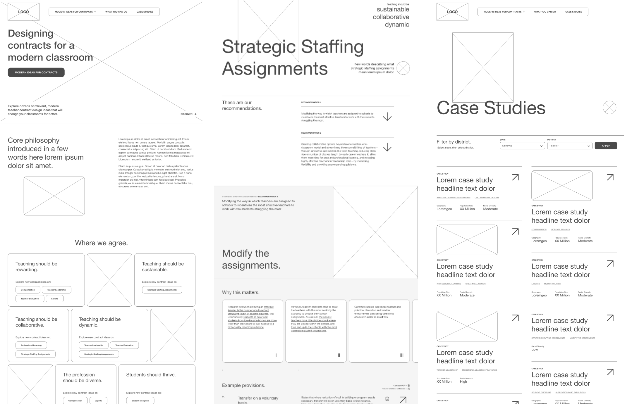
Wireframing
Information architecture
Considerable effort was dedicated to structuring and organizing the microsite to accommodate a substantial volume of information in an easily accessible manner. Employing thematic principles, we curated icons and developed a quiz to aid visitors in locating specific areas of interest. Navigation tools such as breadcrumb trails, anchor links, and tags were implemented to enhance user experience.
Additionally, case studies illustrating real-world instances of contracts elevating educational systems were categorized based on issue area and location to enable content filtering. To facilitate information sharing via email and access E4E’s comprehensive report on agreements and contracts, multiple avenues were strategically placed throughout the microsite.


02
Branding // Design
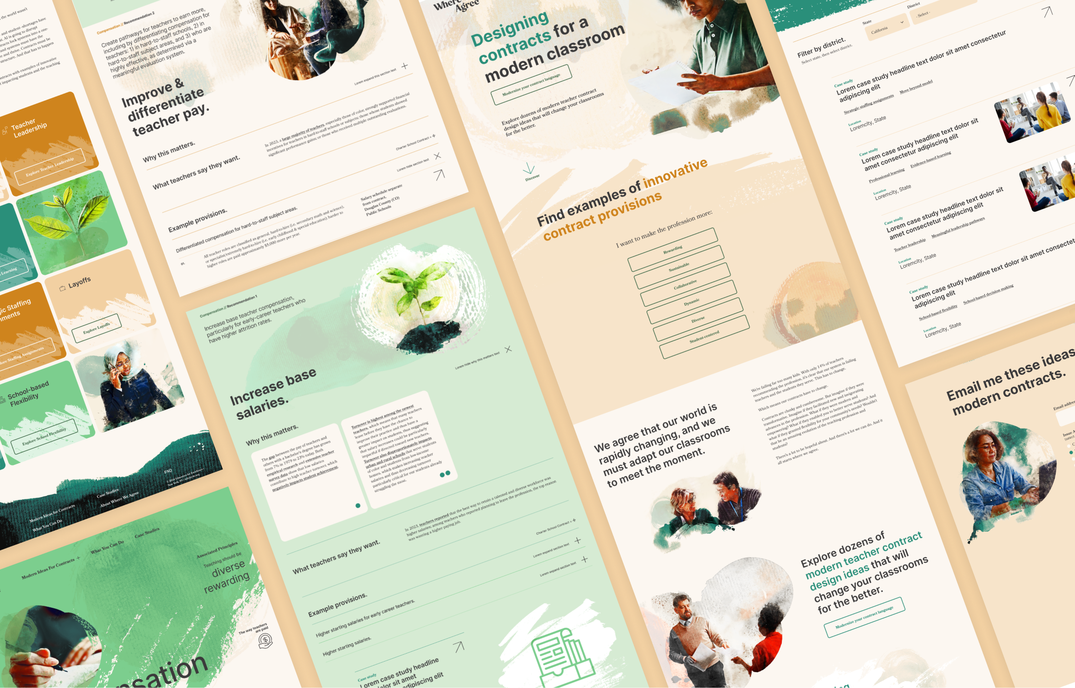
Watercolor and paint
The newly designed logo employs a watercolor texture to highlight checkmarks integrated into the letter "W" in the word "We". To align the visual identity of the microsite with the new sub-brand logo, design elements including painterly brushstrokes, soft watercolor-style imagery, and subtle washes of color were utilized.


03
User testing
Where We Agree 2.0
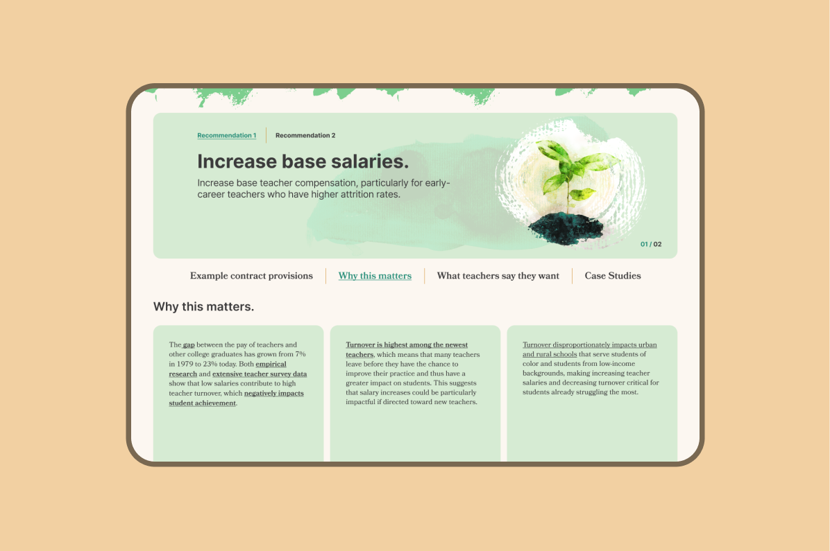
Following the successful launch of the new site, the client expressed a desire to conduct a series of user tests, primarily targeting their largest demographic, teachers. Feedback from these tests highlighted challenges in information accessibility, primarily attributed to scrolling. Per feedback, the site was revamped to include revisions such as optimizing the header design and typography. Furthermore, the issue area pages were overhauled: vertically stacked content was replaced with rotating carousels, and recommendation details were collapsed into dynamically loading tabs for improved user engagement.


